

Thursday, October 29, 2009
ziegfeld girl
this photo is of the ziegfeld girl drucilla strain. when i was preparing for a photo shoot idea for photography last spring term, i used pictures synonymous with this one as inspiration for the look i was trying to achieve. this was taken in the 1920s, a decade that has always fascinated me, and i love the apparel, lighting, and background in this photo.

Monday, October 19, 2009
dolly in the spotlight
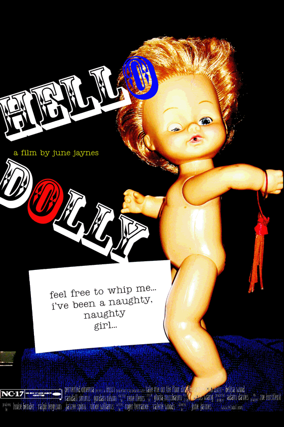
this movie poster wasn't as complex as my "what? you think this is wrong?" movie poster. but it was fun nonetheless. i used a picture that i took, brightened and contrasted the colors to make it more pop-art/graphic, and created type layers. i used the elementary primary colors (red,blue,yellow) just because green wouldn't have looked as appropriate as yellow. the overall concept was a random brain child of mine.
 for larger version visit
http://i356.photobucket.com/albums/oo5/jazzyjune21/dollygif.gif
Sunday, October 18, 2009
choices...
 this is my movie poster inspired by a quote someone i know once said
"what's really bad" she said "is that i'm attracted to both the father and the son."
hence, the movie and it's title.
Thursday, October 15, 2009
i as a painting

 the first photo was taken when my sister and i put together a photo shoot inspired by marcjacobs fashion advertisements. we used pearliss the cockatiel as a live prop. this picture was meant to be very basic and simple. no makeup, bizarre outfits, spontaneous posing, and very natural facial expressions. oh, and bed hair. the concept of the picture and photo shoot was entertaining to put to reality. also, we had modeled in front of a pure white wall which surprisingly produced a natural lomo-esque vignette look.
the second picture, is a painting created by DJ Pettit, an artist well-known in the legions of scrap bookers, paper artists, and other crafters. inspired by my photograph, she painted the lovely picture above! in the painting, it is sweet to observe the drawn relationship between the bird and the girl (me!). the colors are muted and earthy, and overall, i loved to be painted!
Wednesday, October 7, 2009
love?
 this is collage #2. i wanted to do a collage on a craft paper background, so voila! i really enjoyed putting this one together. i did a lot of recoloring, cropping, cutting, magnetic lassoing, and rotating.
teardrops

this is typography assignment number2. inspired by the helvetica film, i used an helvetica 'a'. the a is so well designed because of the slick teardrop negative space. i used that space to my advantage in this design.
loser

this was a design i entered into the earth day logo contest last year
at sou. obviously it didn't win. but it was really fun to make. i used
photoshop to create the design, and within photoshop i recolored,
reshaped, moved, cloned, rotated, ect.
at sou. obviously it didn't win. but it was really fun to make. i used
photoshop to create the design, and within photoshop i recolored,
reshaped, moved, cloned, rotated, ect.
collage inspiration
this has been in my inspirational folder for way too long.
i rediscovered it recently when i was looking at all of the clip art i had amassed.
it provided perfect collage inspiration. this piece is very obtuse, bright, modern, and obscure.
unfortunately at the time i had saved this image, i did not save the artist who did it.
i rediscovered it recently when i was looking at all of the clip art i had amassed.
it provided perfect collage inspiration. this piece is very obtuse, bright, modern, and obscure.
unfortunately at the time i had saved this image, i did not save the artist who did it.

men with capes and guns
 this is one of two typography assignments. i used a j as my letter. the large black 'j's are men with capes and guns.
i thought this would be a different way to approach the assignment, and i really enjoyed the end result.
hands
this is a picture i took in the beginning photography class last spring term. it was for a project having to do with a lot of black lace, nakedness, etc...
this was one of my favorites of the collection because i loved how the hands are featured and the frame of space they shape.
also the shadows, light, and the contrast both make, create a very sculptural feel. this photo was taken on a manual camera, and was developed by hand.
this was one of my favorites of the collection because i loved how the hands are featured and the frame of space they shape.
also the shadows, light, and the contrast both make, create a very sculptural feel. this photo was taken on a manual camera, and was developed by hand.

Sunday, October 4, 2009
fish in the sky

this is my first collage
it looks simple but it took me hours
i did a lot of layering, duplicates, and digital re-coloring
the subject is very random but
i sorta like it
it's a fish in a boot in a sky so blue.


Subscribe to:
Posts (Atom)
