


 this is my book, created in indesign. it was based on a "cirque du soleil" themed photo shoot that my sister and i did. it comprised of lots of color, crazy outfits, and our insanely high black boots.

 this is a non-sequiter pairing, but i couldn't find any good vintage farmer photographs. so instead i have brought one of my favorite old-time celebrity photographs of charlie chaplin and his first love hetta kelly. i love the photographic quality of the image and the expressions on their faces.

 this is a print i found off of etsy.com. i love seeing what other artists are capable of creating. it is very inspiring and makes me want to buy their art. the fine pencil drawing and water coloring of this piece is especially charming.
 this is a picture i took as part of my "goofy miniatures" collection from a couple years back. i cut out words from old books and randomly made a thought, attached it to the tchotcheke, and snap! took a picture.
 she's not seen
 her cries of distress go on unheard
 a sniff is all she gets
 scorned at the playground
 the only man she can find is a fake one
 this is pearliss, the man. taken out of context he/she looks prehistoric. which is a slight bit creepy. but i love this portrait that i took because it is very representative of who pearliss is as a cockatiel. i put it with the erte picture because they both have related birds as the main feature.
 erte is one of my all-time favorite artists. his images are a mix of fashion and art. and for that, i admire. i picked this particular print because it features the big cockatoo.
 etsy.com is one of my favorite places to get inspiration and to shop because of all the amazing artwork out there. this illustration is just a really cute and creative piece. i wanted to juxtapose it with the picture of the robins nest, because both have a bird theme.

http://i356.photobucket.com/albums/oo5/jazzyjune21/dollygif.gif
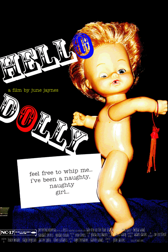
 this is my movie poster inspired by a quote someone i know once said
 the first photo was taken when my sister and i put together a photo shoot inspired by marcjacobs fashion advertisements. we used pearliss the cockatiel as a live prop. this picture was meant to be very basic and simple. no makeup, bizarre outfits, spontaneous posing, and very natural facial expressions. oh, and bed hair. the concept of the picture and photo shoot was entertaining to put to reality. also, we had modeled in front of a pure white wall which surprisingly produced a natural lomo-esque vignette look.
 this is collage #2. i wanted to do a collage on a craft paper background, so voila! i really enjoyed putting this one together. i did a lot of recoloring, cropping, cutting, magnetic lassoing, and rotating.


 this is one of two typography assignments. i used a j as my letter. the large black 'j's are men with capes and guns.


 for larger version visit

